when i went to tasmania, quite a few months ago now, i had the priviledge of photographing my sister katie and her husband ben's little home. i love their place. all the little things just seem to come together in a way that gives this home such a cute personality.
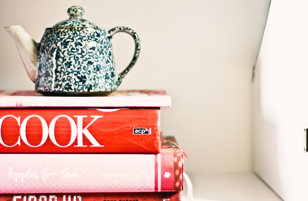
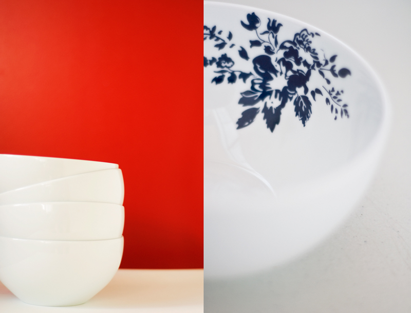
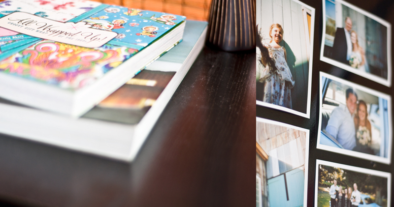
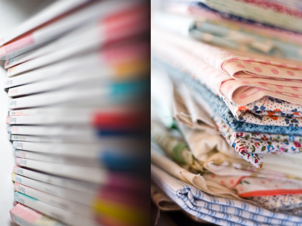
Katie's design style is all about symmetry, clean lines and cute things. She has made these three elements work well together by creating a space where organised piles of fabric, rows of magazines and books and stacks of square t2 boxes complement the cute little things she has placed on the shelves of her bookcase.
What Katie (and Ben) love most about their home is its functionality. "Despite the fact that the whole house is so small, each area is very functional and not a single cubic metre is wasted. My husband lives and breathes functionality. If something is not practical then why use it. Better to throw it away and design something better! (I tend to favour form over function most of the time, much to his disagreement). At the end of the day we have a functional house with the added touches of a home (thanks to me) to give it that aesthetic appeal."
" Our space is very well designed (by Ben’s uncle/architect!). It catches the sun in winter through a high north facing window. This same window is positioned so that very minimal sun beats through in summer, keeping the house cooler. Its height means that it allows optimal light, keeping the place nice and bright and airy, without compromising privacy – no need for curtains or blinds!"
"The living spaces flow easily from one area to the next: living to dining to kitchen. Anyone who has been around to our place would easily notice this. It is nice and open and each area has its own function."
Creating a space that is unique and reflects the people who live there can be challenging when room is limited.
"Working with the limited room has been an ongoing challenge from the day we first set foot in this place. As our needs have changed, so has the way in which we have organised our home. First it was sorting/organising and storing our wedding gifts when we first moved in. Deciding which items to display and which to store away was tricky, as we wanted to show it all. About a year later it was finding a place to store all our newly acquired bushwalking gear (we had fallen in love with the pastime). In the last few months we have been busy re-arranging upstairs and downstairs to make room for our beautiful new addition to the family, our baby boy."
"Luckily, the house was designed with storage in mind. There are lots of ‘hiding’ spots for our things. We’ve also used clever ways of tucking clutter and things out of sight – pretty storage boxes that hide stuff but are appealing enough to be placed in visual areas. Every now and then we have a ‘blitz’ and change an area of storage to make it more functional/practical (usually instigated by Ben!)"
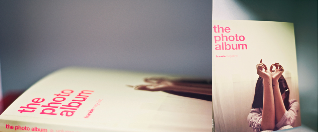
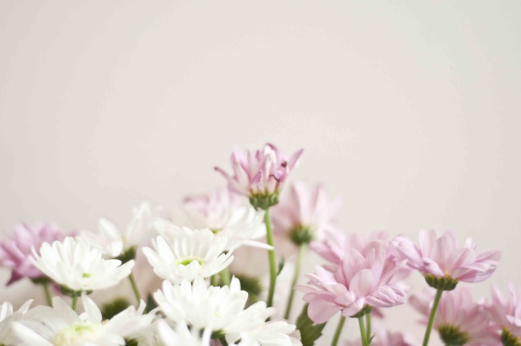
"It becomes a unique space when you add all the things that reflect me and my style…clean lines, symmetrical displays and all the things I love – fresh flowers, tea (+ lots of it!), teapots, books and photos. All these things make it ‘ours.’"
Katie's house is made a home because, as she says, "all the things I love are in it and on display. I just wish I had more space to express myself sometimes! I guess because there’s only a limited space for our bits and pieces we have to be careful that we don’t end up “cluttering” it up too much."
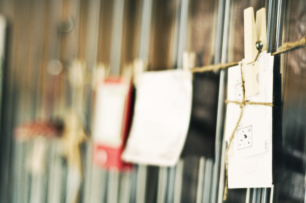
"My favourite place is upstairs – the coziness of our big bed…my craft table which contains piles of yummy fabric just waiting to be crafted into something…my clothesline of cards and other things I’ve made or kept, hanging by little wooden pegs above my craft table. I love to sit downstairs on the couch whilst I’m feeding my little boy and admire the upstairs area I can see. I think the beautiful plywood tree Ben made last Christmas really fits in with this area nicely.
All of Eamon’s things have made our house very homely as well – mobiles, his owl wall decal, white cot and change-table and the shelves above containing so many of his ‘baby’ things."
This won't be home for Katie and Ben forever - they have plans to build a new house. Will the same design features carry over into the new house?
"I think we will continue this design in some ways in that our next house will also be functional. We are functional people so we would like to plan for each of our living spaces to be practical. The same architect who designed our unit has also had input into our new house so once again it will have some clever features, with some more modern touches as well. It will continue to be an open living theme but hopefully will reflect more of our personal styles and what we would like out of our house – I can’t wait!"
We can't wait either to come visit you either, Katie and Ben! Thank you so much for letting me 'into your window'!


A nice little write-up, Aimee!
ReplyDeleteOne little mistake; it's spelled "privilege".
I really love the shot of the purple and white flowers. 'Tis wonderful indeed!
ReplyDeleteLove Nicole
oh my my your blog is a bit on the lovely side of things!
ReplyDeletei enjoy your gazing at the pretty pictures ever so much.